Damonza.com, my design firm, has delivered three great concepts for The Mark of the Spider: A Black Orchid Chronicle.
Three design treatments, three color schemes.
Which cover — because we ALL judge a book by its cover — would make you pick it up and read it? Let me know by Wednesday night, EDT, either by comment or email.
The candidates are Blue, Green, Red:


I’m having a hard time choosing so your input will count for a lot. A LOT.

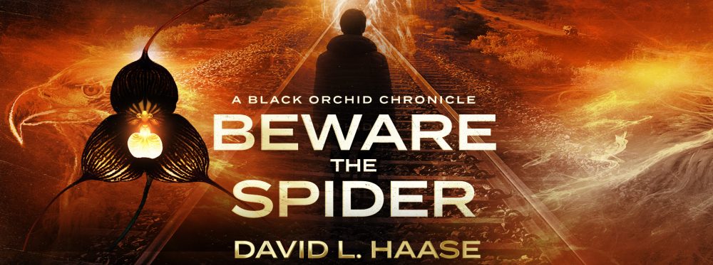
Red looks like the author’s name is Mark Spider. The other 2 have “the” in the same font size as “Mark,” so it’s not confusing. The orchid in Green is vaguely vulva-like. Design-wise, I like Blue better but I prefer the Red face over the Blue face.
Blue please.
I love the blue. To me, it’s the most haunting.
Pat
I agree with the commenter above: I like the Blue design, but the face on the Red more closely resembles my mental impression of Sebastian. I don’t recall him having a mustache.
I like the third one.
Red!
I like the blue design.
Blue but would prefer no face or more vague face so I can imagine it myself.
Dave, I like the one on the left best. It is darkest, and only suggests the figure in the picture. Great image! Good Luck!
I like the blue one – I like the mystery in the face much better than the middle one which looks like it was a movie – to me the third one is a distant third
Pingback: Book Cover Finalists (Revised) | David L. Haase